
My 18-Color Watercolor Palette | 2022
For the last few years, all my main palettes (the ones I use 99% of the time) have been plastic folding palettes.
Plastic folding palettes are afforable, lightweight, and portable. There are however, a few “issues” with using plastic palettes (both folding and non-folding) that seems to come up for just about anyone who has used one long enough:
The paint beads up on the surface (most noticeable when brand new)
The plastic can become stained and left with color “ghosting”
The dried paint in the wells fall out and stop “sticking” to the palette
There are ways to manage the issues above. You can google it and find many suggestions on “how to prep a plastic palette” to prevent beading. Olive oil and a bit of elbow grease may help with staining. Use a drop of gum arabic to “glue” back the dried paint that has fallen out of the well.
Personally, none of these truly bothered me enough to prevent me from continuing to expand my folding plastic palette collection.
But here I am today, sharing my new 18-well porcelain palette. And I’ll share the reasons why I chose to make the switch and give it a try:
Size
This was the biggest factor that caused me to search for a different palette. I do a lot of filming for lessons and exercises inside the Paint With Me membership community. A big palette takes up a lot of space on my desk and in the videos and I’ve always had trouble fitting my whole plastic palette in the video. Porcelain palettes come in very small sizes and very large sizes as well. There are a lot to choose from!
Staining & Cleaning
As I mentioned before, plastic palettes are likely to stain over time. Porcelain will not stain and is easy to clean. There’s something about being able to clean off my palette and seeing a nice clean mixing area from time to time. (Full disclosure, I’m kind of lazy about cleaning my palette and just use what’s there if it works with my current palette)
Weight
Plastic is plastic and no matter what something about it will always feel “flimsy”. In this case it’s not poorly made, it’s just the nature of the material. I can’t tell you how many times I’ve been painting and nearly flipped over my palette. Porcelain is heavier and, well, just feels nice and substantial.
My 18-Well Porcelain Palette
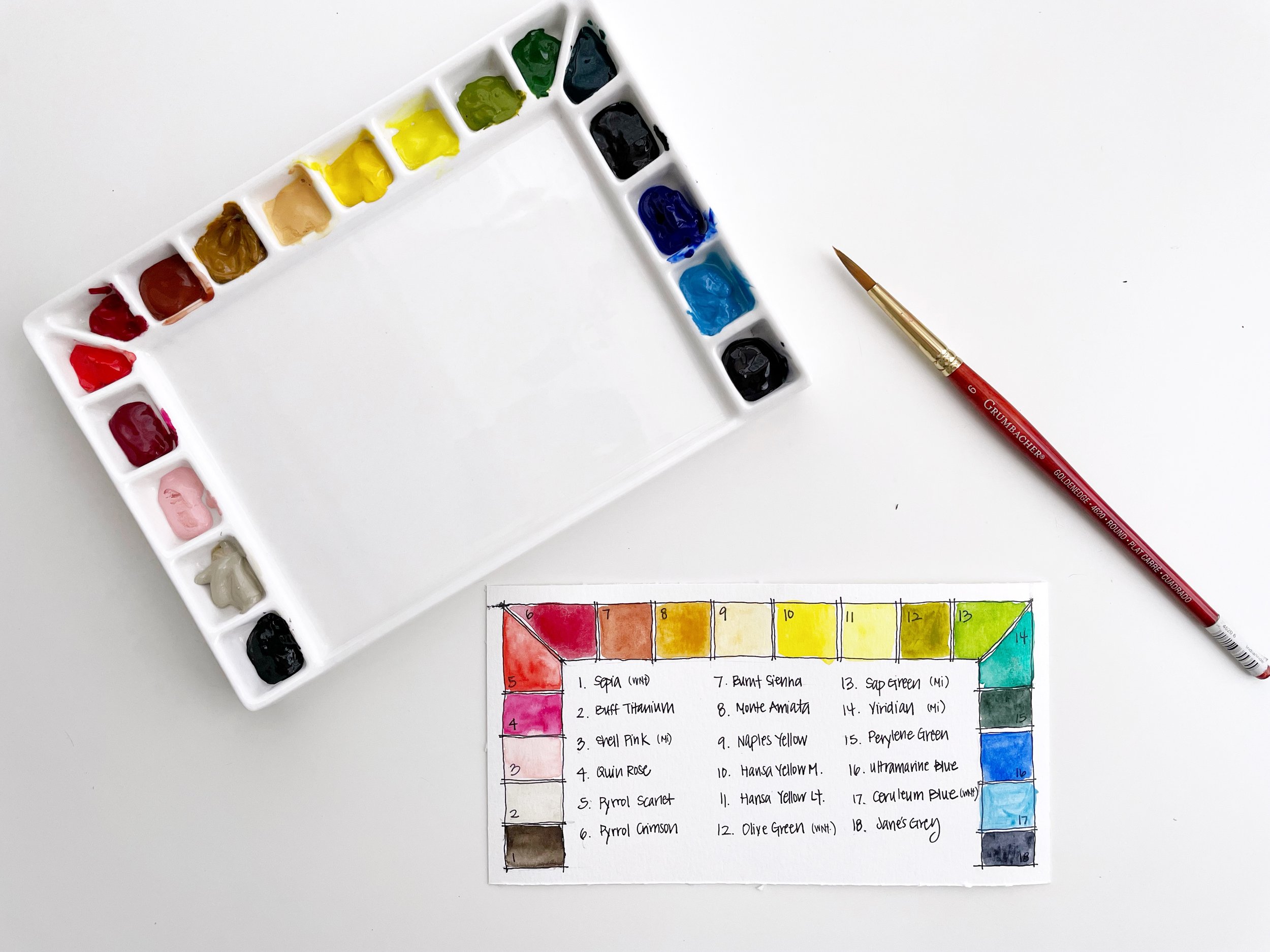
When I came across this palette, it seemed like it would be a good size. The wells are on the small size, but I don’t like to squeeze out too much paint anyways. It had an adequate mixing area and it was reasonably priced. Easy decision to give it a try, so here I am with this new palette.
Paint Selection
I can’t tell you exactly why I use the paints I use. I believe it’s an evolutionary process for most - at least it is for me. I’m not one of those people who does comparison shopping and deep research, so in that way I won’t be of much help here.
My selections are based on:
Recommendations from others
History of repeated use over time
Curiosity to try something new
When I first began painting with watercolors, and decided to buy new paints, I started with all student-grade Winsor & Newton Cotman watercolors. I eventually switched all of them out to artist-grade Daniel Smith.
Why Daniel Smith? Because I was gifted my first few tubes from a friend and decided I should stick with the same brand to build my next palette.
I believe at the beginning I had all but one color from Daniel Smith and actually, that really bothered me!
Over time, after learning from other artists, painting more, and testing colors here and there, my collection has changed to include different brands and new colors. It’s a big mix now, and it will likely continue to evolve - which is totally fine by me.
Color Arrangement
Deciding what order to put the colors in when squeezing them out can be confusing. I’ve changed my “system” over the years but it’s always roughly stayed the same.
I don’t necessarily abide by any strict rules that have to do with color theory, or anything like that. If it happens to follow those rules, it’s likely just a coincidence.
My initial instinct is to put in colors by the order they appear in the rainbow. It’s the most visually pleasing to me and that is important for me to see and feel inspired by when I sit down to paint.
There are always some colors like orange-browns, creams, and grays, that could work in different areas, but this is what I’ve settled on as of late:
Earth/Creams (could also go at the end after greys)
Pinks
Reds
Oranges (including earth oranges)
Yellows (including earth yellows)
Greens
Blues
Greys
Even this order is “flexible” for me. I could start with cream and end with a dark brown like sepia. Or I could start with pinks and end with a cream, for example.
For me, I like how this results in an order that looks like a rainbow. It’s pleasing to my eye and makes the most sense in my own head.
There are many good technical reasons for putting certain colors in certain places and in a certain order, but at the end of the day, I believe in doing what works best with for our own personal creative practices.
That being said, it still helps to start somewhere and then figure out if it actually works for you. So hopefully this information may give you a place to begin - if you are searching for a bit of guidance.
Finally, if you are the type of person who enjoys understanding the technical reasoning behind color selection and placement, a member of my painting community shared this very informative and well-written post!
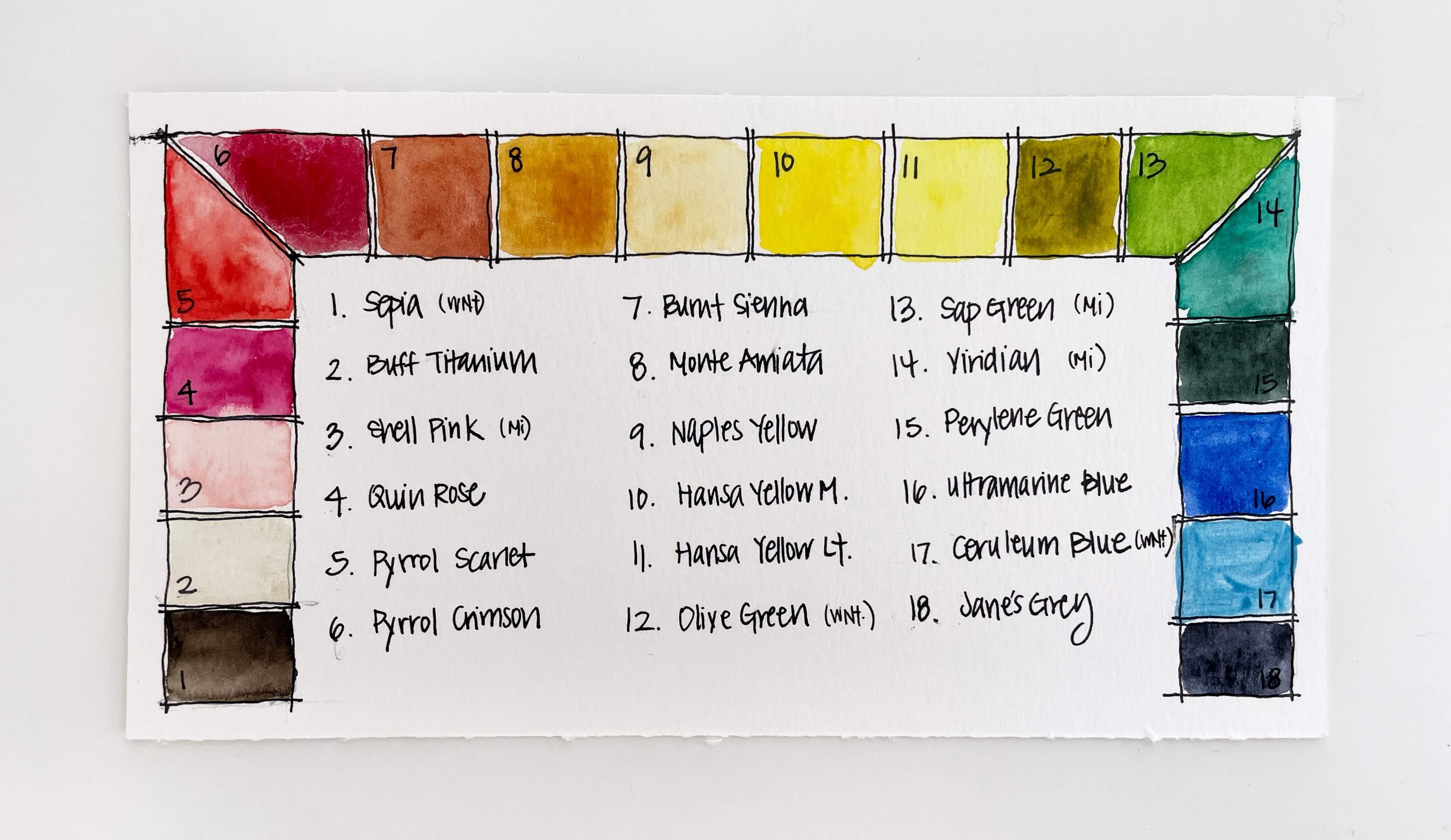
My 18 Color Selection: 2022
Since it’s easy to forget exactly what I put in my palette, I like documenting it by making a palette swatch card. (If you need a bit of guidance on how to create one, check out my post here.)
This one was done very imperfectly (pen smears and crooked writing galore) but it does the job. I usually write the date on the back of the swatch and keep it close by in case I want to reference it.
Below is a list of the colors and paint brands in this palette.
Brand Key:
Sepia | WNt
Buff Titanium | DS
Shell Pink | MI
Quinacridone Rose | DS
Pyrrol Scarlet | DS
Pyrrol Crimson | DS
Burnt Sienna | DS
Monte Amiata Natural Sienna | DS
Naples Yellow | DS
Hansa Yellow Medium | DS
Hansa Yellow Light | DS
Olive Green | WNt
Sap Green | MI
Viridian | MI
Perylene Green | DS
Ultramarine Blue | DS
Ceruleum Blue | WNt
Jane’s Grey | DS
As I’ve begun using this palette, there are already colors I’m not quite sure will stick around…but I guess we’ll see. I’ll probably “edit” my palette again next year. If I do, I’ll likely do another updated post about what I’m using.
If you’d like to come along and watch me fill the palette while I casually chat about some of the things I wrote about above, check out the video below:
Thank you so much for reading,
Susan